Frontiers and Generations Album Covers
As an on and off (mostly off) visitor to this forum it's hard to know what's been covered and what hasn't. But I'm in one of my Journey "binge" modes, to borrow a phrase, and I maybe I'm crazy but do you see similarities in these two covers?
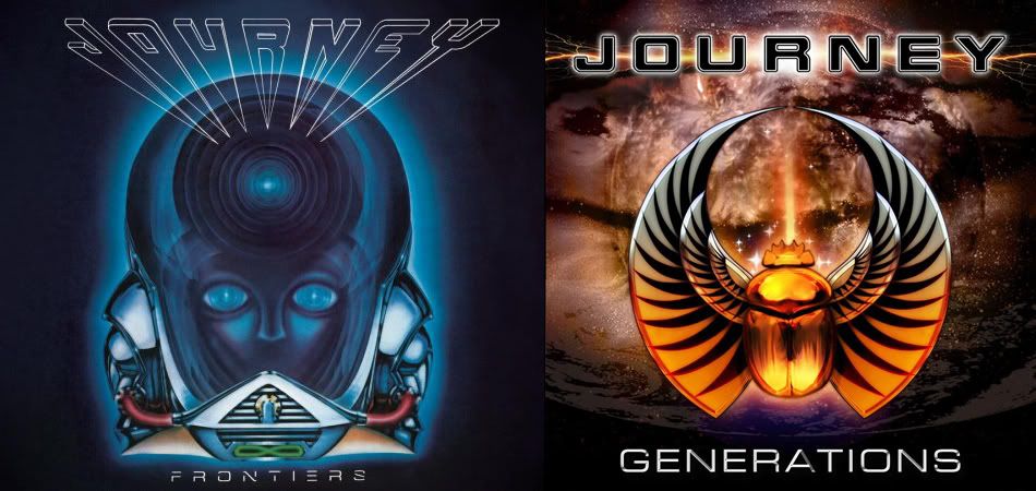
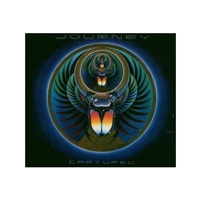
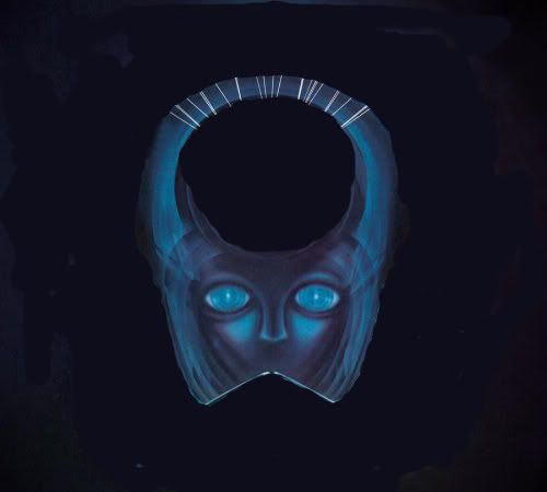
I was reading the two Herbie Herbert interviews and the Frontiers artwork was mentioned in both. Perry didn't like the art that was on the table for Frontiers and they ended up going with Elmo which some people have strong opinions about. It obviously doesn't have anything to do with what came immediately before and afterwards. But then I'm looking at Generations which is much later, without Perry, and I think to myself that someone was having a little fun. Maybe there's some scarab imagery in Frontiers after all.
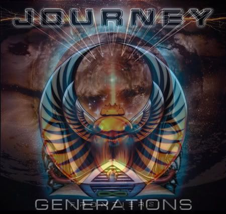
Take a look at the Scarab on Generations. The wings surround what appear to be eyes. Now look at Elmo's eyes. There's other similarities.
At the bottom of Elmo's helmet there's like a wedge shaped thing (like a Darth Vader breather) and on the Generations cover there's a similar wedge formed by the the trailing edge of the Scarab's wings.
The fonts are pretty close on both. Look at the other albums and you'll see that many times the font that the word "Journey" is printed with is not uniform. But here we have two albums in which the Journey font is similar.
I layered the Frontiers cover over Generations and lined up the Journey title at the top as best I could. I had to scale the image slightly but it fits pretty remarkably. And the breather notch thing really matches up pretty well with the notch formed by the bottom of the Scarab's wings as do the names of the albums though the Frontiers title is much smaller.
If nobody agrees I'll blame it on sleep deprivation.
I was reading the two Herbie Herbert interviews and the Frontiers artwork was mentioned in both. Perry didn't like the art that was on the table for Frontiers and they ended up going with Elmo which some people have strong opinions about. It obviously doesn't have anything to do with what came immediately before and afterwards. But then I'm looking at Generations which is much later, without Perry, and I think to myself that someone was having a little fun. Maybe there's some scarab imagery in Frontiers after all.
Take a look at the Scarab on Generations. The wings surround what appear to be eyes. Now look at Elmo's eyes. There's other similarities.
At the bottom of Elmo's helmet there's like a wedge shaped thing (like a Darth Vader breather) and on the Generations cover there's a similar wedge formed by the the trailing edge of the Scarab's wings.
The fonts are pretty close on both. Look at the other albums and you'll see that many times the font that the word "Journey" is printed with is not uniform. But here we have two albums in which the Journey font is similar.
I layered the Frontiers cover over Generations and lined up the Journey title at the top as best I could. I had to scale the image slightly but it fits pretty remarkably. And the breather notch thing really matches up pretty well with the notch formed by the bottom of the Scarab's wings as do the names of the albums though the Frontiers title is much smaller.
If nobody agrees I'll blame it on sleep deprivation.