Journey Album Cover Art
Moderator: Andrew
Journey Album Cover Art
![]() by heardonthestreet » Sun Sep 17, 2006 4:24 am
by heardonthestreet » Sun Sep 17, 2006 4:24 am
-
heardonthestreet - Cassette Tape
- Posts: 2351
- Joined: Mon Feb 07, 2005 3:23 am
- Location: "How Can I Keep From Singing?"
.jpg)

Re: Journey Album Cover Art
![]() by Matthew » Sun Sep 17, 2006 4:43 am
by Matthew » Sun Sep 17, 2006 4:43 am
heardonthestreet wrote:Arrival and Generations has got to have the worse album covers. They should have had some sort of contest. Arrival looks like a big fat turkey, a forecast of it's future, and Generations looks like a bird dog with a bird in it's mouth. Raised On Radio is my favorite. The color and the symbolism. I can't believe how many people don't play the radio anymore.
I couldn't agree more. Perry was right to ditch all that 70s stoner imagery...the scarabs and the bird wings and all that crap.
I'd bring Prairie Prince back to take control of the band's artwork...
-
Matthew - Stereo LP
- Posts: 4979
- Joined: Fri Jul 28, 2006 2:47 am
- Location: London
![]() by Rockindeano » Sun Sep 17, 2006 5:07 am
by Rockindeano » Sun Sep 17, 2006 5:07 am
The scarab and wings says Journey without a word being mentioned.
-
Rockindeano - Forever Deano
- Posts: 25864
- Joined: Thu Jul 22, 2004 2:52 am
- Location: At Peace
![]() by Liam » Sun Sep 17, 2006 5:16 am
by Liam » Sun Sep 17, 2006 5:16 am
AR wrote:Trial by Fire's cover looks like a homo's dream. Seriously, they should have just put two guys on there boning each other to complete that atrocity.
Red 13 is a close second.
I'll agree with you on TBF....but I like the Red 13 cover....at least the original "artwork". Looks kinda like a football jersey to me.
"It ain't how hard you can hit. It's how hard you can get it, and keep goin'." - Rocky
-

Liam - MP3
- Posts: 10064
- Joined: Tue May 02, 2006 2:54 am
![]() by AR » Sun Sep 17, 2006 5:18 am
by AR » Sun Sep 17, 2006 5:18 am
I'll agree with you on TBF....but I like the Red 13 cover....at least the original "artwork". Looks kinda like a football jersey to me.
I can sort of understand that. Ok, since it's an EP, maybe that is alright.
I will add that the original artwork for Arrival with the sandy/gold/brown background was really fugly.
-

AR - Digital Audio Tape
- Posts: 8531
- Joined: Sat Nov 26, 2005 10:21 am

![]() by Matthew » Sun Sep 17, 2006 5:25 am
by Matthew » Sun Sep 17, 2006 5:25 am
Rockin'Deano wrote:Yeah, and The ROR is so fresh
The scarab and wings says Journey without a word being mentioned.
Bringing the scarab and wings back didn't help to sell many records though, did it?
It really is the type of art that might have looked okay on a 14 year old boy's bedroom wall in 1976....but in 2006? Sorry - I'm just not feeling it.
Having said that...I'd take the scarab over the 'surrealism' on the cover of TBF and Greatest Hits Live. Does anyone know who designed those covers?
-
Matthew - Stereo LP
- Posts: 4979
- Joined: Fri Jul 28, 2006 2:47 am
- Location: London
![]() by AR » Sun Sep 17, 2006 5:27 am
by AR » Sun Sep 17, 2006 5:27 am
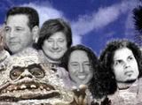
How about this one?
( Ok, this one has not been made yet but just wishful thinking! )
That has to be the title of the next album. Looks good. Maybe do something more with the Journey logo, but I'm onboard otherwise.
-
AR - Digital Audio Tape
- Posts: 8531
- Joined: Sat Nov 26, 2005 10:21 am
![]() by Glenn » Sun Sep 17, 2006 5:27 am
by Glenn » Sun Sep 17, 2006 5:27 am
Its Me wrote:JSS Rocks! wrote:How about this one?
( Ok, this one has not been made yet but just wishful thinking! )
looks pretty damn good!!! Nice job
Thanks but I didn't do it...Friend did...Pretty cool though!!
-

Glenn - Cassette Tape
- Posts: 1262
- Joined: Fri Aug 11, 2006 10:30 am
- Location: TEXAS


![]() by heardonthestreet » Sun Sep 17, 2006 5:33 am
by heardonthestreet » Sun Sep 17, 2006 5:33 am
JSS Rocks! wrote:Its Me wrote:JSS Rocks! wrote:How about this one?
( Ok, this one has not been made yet but just wishful thinking! )
looks pretty damn good!!! Nice job
Thanks but I didn't do it...Friend did...Pretty cool though!!
...................................
This would work for a Perry reunion, especially the title.
-
heardonthestreet - Cassette Tape
- Posts: 2351
- Joined: Mon Feb 07, 2005 3:23 am
- Location: "How Can I Keep From Singing?"
![]() by Wheels Of Fyre » Sun Sep 17, 2006 8:52 am
by Wheels Of Fyre » Sun Sep 17, 2006 8:52 am
Departure79 wrote:...but I like the Red 13 cover....at least the original "artwork". Looks kinda like a football jersey to me.
The original art is my favorite, too. It's actually a play on the winged disk motif - or as someone here has called it "stoner imagery." It's actually an ancient mystic symbol.
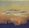
I think the most clever play of it is used on ROR. The ROR symbol is a pretty slick winged disk motif! I actually think it should've been larger and more in the center of the cover with the JRNY radio station slightly beneath it and those obnoxious, cartoonish roads removed entirely.
The Garden of Eden can't be found on a map. It's not a geographical location. It's right where you are - if you're in the spirit.
- Wheels Of Fyre
- Cassette Tape
- Posts: 1366
- Joined: Sat Aug 19, 2006 2:16 am
- Location: Ohio
![]() by Its Me » Sun Sep 17, 2006 9:06 am
by Its Me » Sun Sep 17, 2006 9:06 am
Greggie wrote:JSS Rocks! wrote:Here are 2 more ... trying to keep the whole "Phoenix rising from the ashes" vibe.
I like both of those!
I agree!!!! The Phoenix rising!!! Like both of these as well, still partial to the first one though!!!!
-

Its Me - 45 RPM
- Posts: 276
- Joined: Wed Sep 06, 2006 9:28 am
![]() by Wheels Of Fyre » Sun Sep 17, 2006 2:15 pm
by Wheels Of Fyre » Sun Sep 17, 2006 2:15 pm
JSS Rocks! wrote:Here are 2 more ... trying to keep the whole "Phoenix rising from the ashes" vibe.
I like this one. There's a lot of character in the bird's face and I like it's position - kind of like one of the many great comic book covers created by Jack Kirby. The bird seems to be coming right at you.
I have to say that I like "Resurrection" as a title however it carries too much religious baggage.
I really like ASCENDANT.
The Garden of Eden can't be found on a map. It's not a geographical location. It's right where you are - if you're in the spirit.
- Wheels Of Fyre
- Cassette Tape
- Posts: 1366
- Joined: Sat Aug 19, 2006 2:16 am
- Location: Ohio
Re: Journey Album Cover Art
![]() by A Fire Inside » Mon Sep 18, 2006 12:01 pm
by A Fire Inside » Mon Sep 18, 2006 12:01 pm
heardonthestreet wrote:Arrival and Generations has got to have the worse album covers.
Arrival is fine, but Generations is terrible. I hope Stanley Mouse got whoever did that one for his plagiarism of Captured.
- A Fire Inside
- Cassette Tape
- Posts: 1309
- Joined: Tue Dec 23, 2003 2:00 pm
![]() by Ms_M » Mon Sep 18, 2006 12:26 pm
by Ms_M » Mon Sep 18, 2006 12:26 pm
- Ms_M
- Stereo LP
- Posts: 3884
- Joined: Tue Jul 11, 2006 2:35 pm
- Location: Humble, Tx
![]() by The_Noble_Cause » Mon Sep 18, 2006 2:02 pm
by The_Noble_Cause » Mon Sep 18, 2006 2:02 pm
"Generations" looks pretty much the way Dave28 first described it.
Like someone lazily cutn'pasted the Captured scarab ontop of an Astronomy text book cover.
Lazy and disinterested all around.
Much like Neal's attitude concerning the album itself.
-

The_Noble_Cause - Super Audio CD
- Posts: 16239
- Joined: Mon Oct 25, 2004 9:14 am
- Location: Lake Titicaca
![]() by kathyhelms » Tue Sep 19, 2006 10:56 am
by kathyhelms » Tue Sep 19, 2006 10:56 am
- kathyhelms
- 45 RPM
- Posts: 219
- Joined: Thu Dec 29, 2005 12:52 pm
- Location: burleson TX
![]() by A Fire Inside » Tue Sep 19, 2006 1:16 pm
by A Fire Inside » Tue Sep 19, 2006 1:16 pm
kathyhelms wrote:Do you mind asking the artist what program they used? I have paint shop pro 9 but am still learing the basics. I would love to learn how to do this sort of thing on the computer.
The first looks painted, and the second... well, I'm no expert but I have Photoshop and I'm pretty sure you need something a little better than that for CG art.
- A Fire Inside
- Cassette Tape
- Posts: 1309
- Joined: Tue Dec 23, 2003 2:00 pm
![]() by brandonx76 » Tue Sep 19, 2006 1:30 pm
by brandonx76 » Tue Sep 19, 2006 1:30 pm
-

brandonx76 - Cassette Tape
- Posts: 1933
- Joined: Mon May 24, 2004 11:16 am
- Location: Beyond the Sun
![]() by jrnyman28 » Wed Sep 20, 2006 6:55 am
by jrnyman28 » Wed Sep 20, 2006 6:55 am
Matthew wrote:Having said that...I'd take the scarab over the 'surrealism' on the cover of TBF and Greatest Hits Live. Does anyone know who designed those covers?
Steven Adler was the artist for TBF and GHL.
- jrnyman28
- Compact Disc
- Posts: 6759
- Joined: Thu Sep 12, 2002 2:15 pm
![]() by Lilla_Forever » Wed Sep 20, 2006 7:00 am
by Lilla_Forever » Wed Sep 20, 2006 7:00 am
Worst cover gotta be Raised on Radio. I love the music on it to death, but I think the cover art is a bit unimaginative... Trial By Fire's cover may be a bit pretentious but it is more effective I think.
-

Lilla_Forever - 45 RPM
- Posts: 286
- Joined: Wed May 03, 2006 3:12 am
- Location: Scandinavia
![]() by jrnyman28 » Wed Sep 20, 2006 7:04 am
by jrnyman28 » Wed Sep 20, 2006 7:04 am
Lilla_Forever wrote:Worst cover gotta be Raised on Radio. I love the music on it to death, but I think the cover art is a bit unimaginative...
I feel exactly the opposite...don't care so much for the music but thought the artwork was wonderful. If they "had" to ditch the scarab than this was a good way to do it. Unlike Elmo...
- jrnyman28
- Compact Disc
- Posts: 6759
- Joined: Thu Sep 12, 2002 2:15 pm
Who is online
Users browsing this forum: No registered users and 12 guests